
How do you turn a data-heavy, frustrating platform into a seamless experience that users trust? At Nimbus, I led a research-driven redesign that simplified navigation, improved workflows, and addressed key usability issues—earning excitement from stakeholders and future users even before launch.
This case study complies with UK regulatory and confidentiality requirements. Some details have been adapted while preserving the authenticity of the design process and measurable outcomes.
Project Snapshot:
Role: Sole Product Designer
Team: 2 PMs, 2 BAs, 5 Developers, 4 Data Engineers, 2QA
Platform: Web
Tools: Figma, FigJam, Polifish, Microsoft Clarity, User Testing, Atlassian, ChatGPT, Grok, Teams, etc.
Timeline: Ongoing
Redesigned UI across multiple devices.
About the product:
"Advanced Maps" helps UK property professionals discover valuable real estate opportunities.
It aggregates data from multiple sources to help users:
Identify viable development sites
Check planning, ownership, and investment potential
Communicate directly with landowners
Track and manage deals across projects
With complex datasets and a powerful toolkit, "Advanced Maps" is built to support users in making fast, confident decisions.
30%
user friction reduced with redesigned flows & smart onboarding
25%
user satisfaction improved through usability testing
design fidelity achieved in development handoff
The Challenge: Simplifying Complexity
"A powerful platform held back by complexity"
When I joined Nimbus, the platform was feature-rich but difficult to navigate. Users rated the "Advanced Maps" interface 6.3 out of 10, and many required customer support for basic tasks. The steep learning curve particularly challenged new users, creating barriers to adoption.
Despite its value, users struggled with:
Navigating an overloaded interface
Finding filters and relevant search tools
Interpreting dense property information
Users frequently relied on third-party tools due to the complex interface
Crashes and long loading times made users frustrated
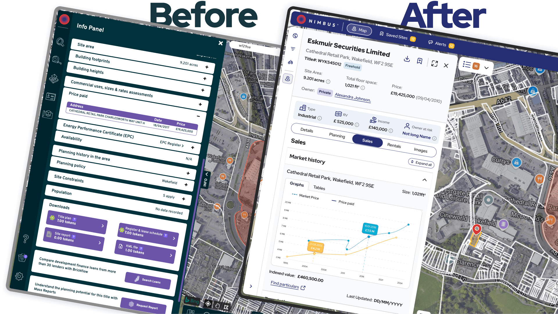
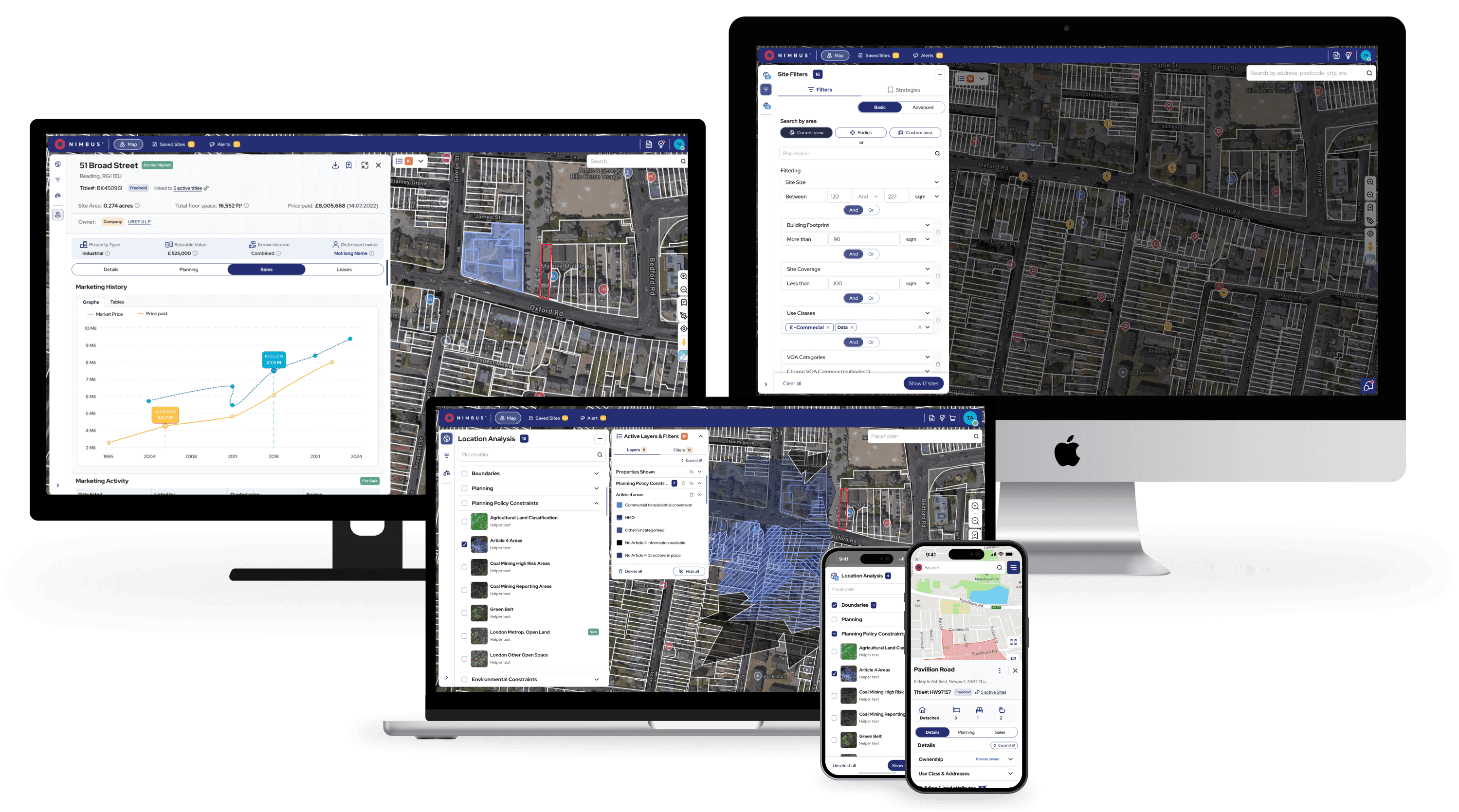
Before and after: Site card redesign showing improved information hierarchy and reduced cognitive load.
My Role & Approach:
As the sole designer, I led end-to-end UX—from discovery to delivery:
Led user-centred discovery through interviews, surveys, and early usability tests—laying the foundation for design decisions.
Mapped user flows and designed lo-fi wireframes
Built a new design system from scratch
Created interactive prototypes and ran usability testing cycles to validate and refine key features
Collaborated closely with developers for high design fidelity (98% accuracy)
Research: Listening Before Designing:
To ensure the redesign of "Advanced Maps" from Nimbus was user-centric, I used a mix of qualitative and behavioral research methods:
User Interviews: Conducted 30+ interviews with seven personas (e.g., property developers, surveyors, investors) to understand workflows and pain points.
Surveys: Collected 70+ responses via a platform-wide survey to validate user patterns.
Behavioral Analytics: Used Pendo and Microsoft Clarity to track drop-off points, underused features, and high-friction zones via clickstream data, heatmaps, and scrollmaps.
Information Architecture Testing: Ran card sorting and tree testing to improve navigation and feature discoverability.
Usability Testing: Tested redesigned flows and features (filters, comparables, letter generation) with moderated sessions and task-based scenarios, iterating to refine layouts and reduce confusion.
This ensured a functional, intuitive, and trustworthy product for all users, including first-timers.
Uncovering Pain Points
To design better, I had to learn how users think—and where the platform held them back.
Cross-persona research revealed consistent pain points that cut across experience levels:
50% of users still relied on Excel due to the steep learning curve of Advanced Maps
Filters were difficult to find, with some users spending over 5 minutes locating them
Core features were hidden or unclear to new users, making onboarding a struggle
Users wanted quick, surface-level insights on ownership, planning, and suitability—without needing to dig through layers of data
These findings became the foundation for simplifying navigation, improving feature discoverability, and designing more intuitive workflows.
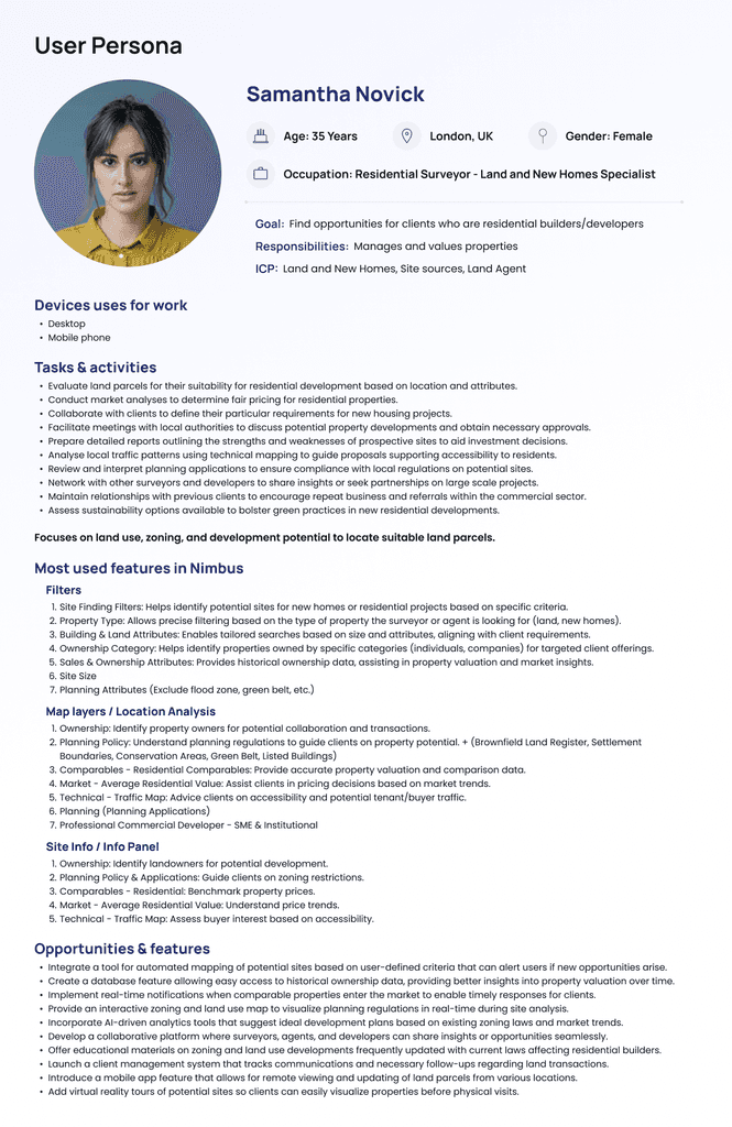
Key persona insights for design alignment.
Competitor Analysis: Understanding the Market
I analysed direct competitors (LandTech, LandHawk, CoStar, SearchLand) and established platforms (Rightmove, Zoopla) to identify usability patterns and differentiation opportunities that could inform our design decisions.
Designing the Solution: A New Experience from the Ground Up
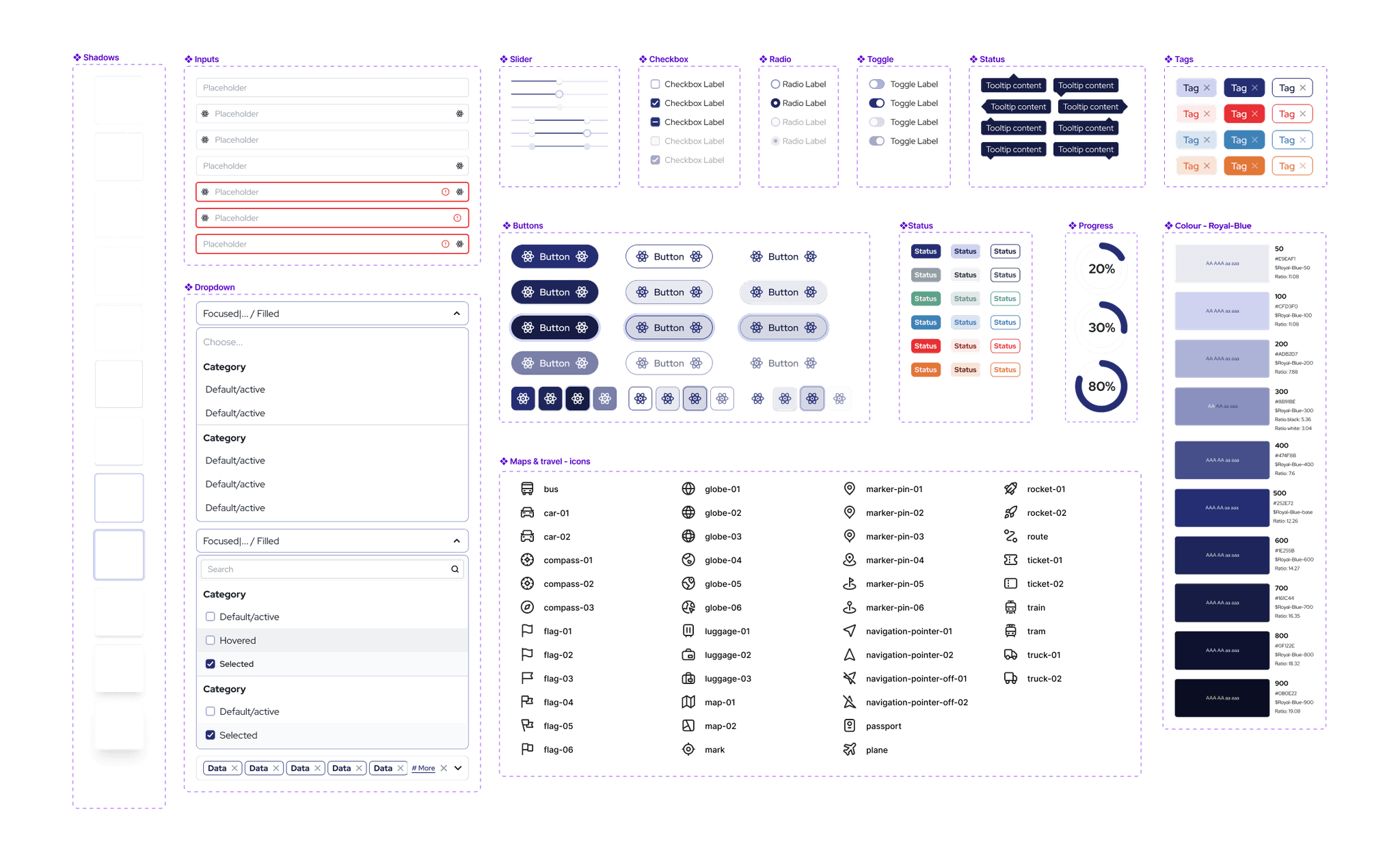
Small part of components for the custom design system.
Design System
When I joined, Nimbus had just launched a new logo—but no product design framework. I created the design system from scratch, choosing a colour palette that aligned with the new brand and crafting components that supported both clarity and scalability.
To ensure consistency across the platform, I also wrote detailed documentation within ZeroHeight on how each element should behave—covering interaction states, spacing, responsiveness, and accessibility best practices. This made it easier for developers to implement designs accurately and for the team to maintain a unified experience as the product evolves.
User Flow & Wireframing: Laying the Foundation
I redesigned core user workflows to reduce complexity and improve task completion rates. Key improvements included streamlined filter application, intuitive map layer controls, enhanced site detail views, simplified saving mechanisms, and efficient report generation.
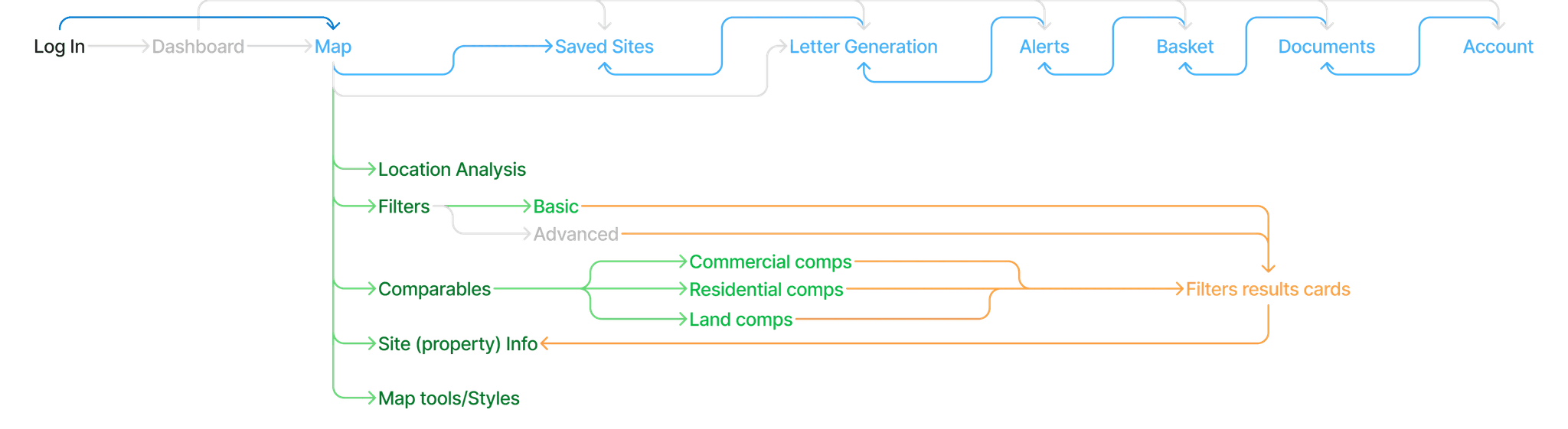
To visualise how users move through the new experience, I created a user flow capturing core tasks and decision points.
Early wireframes used to validate layout concepts and improve navigation logic.
Prototyping & Usability Testing
Interactive prototypes allowed me to test ideas quickly and gather actionable feedback before development. I focused on:
Improving filter discoverability through clearer layout and access points
Reducing cognitive overload by simplifying how property data is displayed
Highlighting key information upfront (e.g., ownership, planning status) to support faster decision-making
Testing and refining new features like advanced filters and letter generation through usability sessions
Continuously iterating on core workflows based on feedback from real users
Deep dive in features
Based on user feedback and testing data, I prioritised redesigning four critical features that showed the highest friction points and directly impacted user workflows:
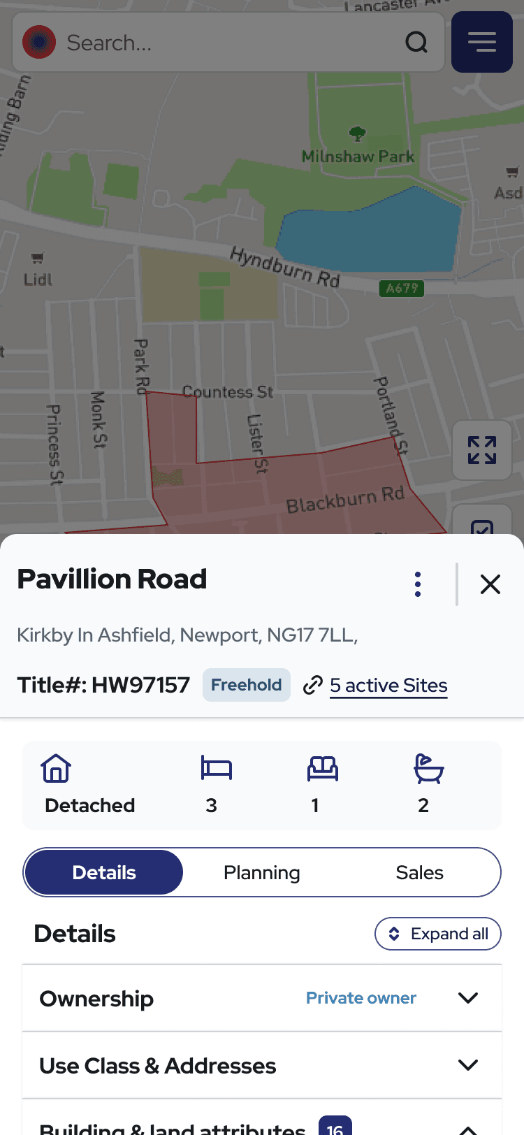
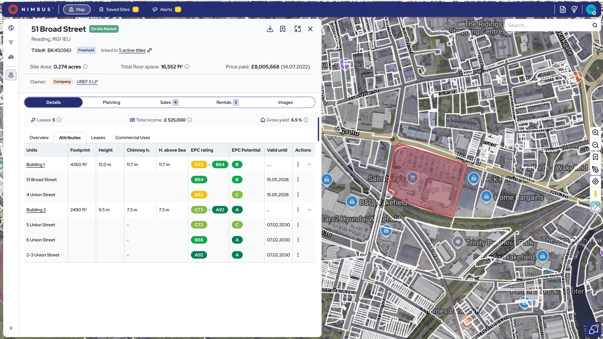
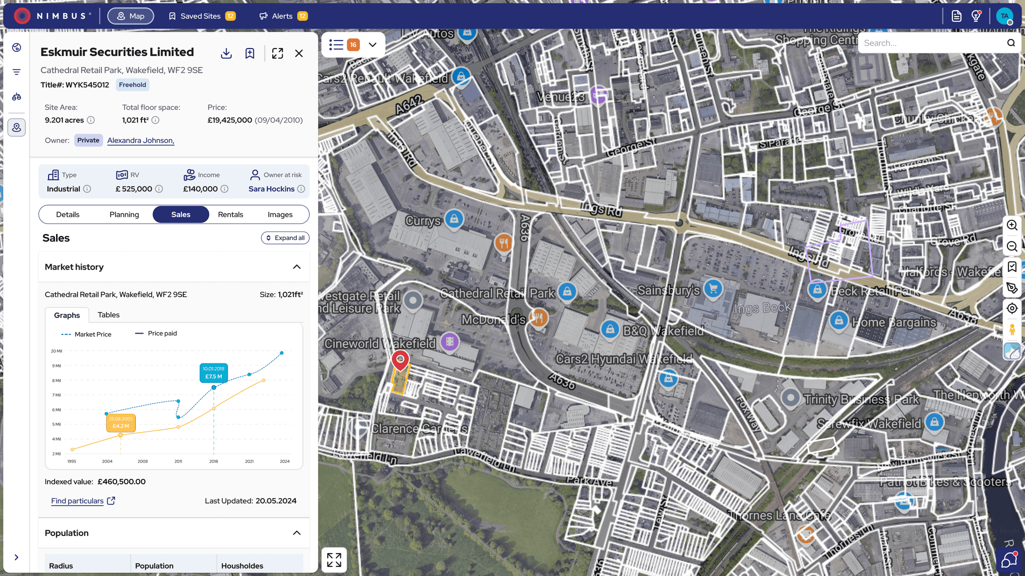
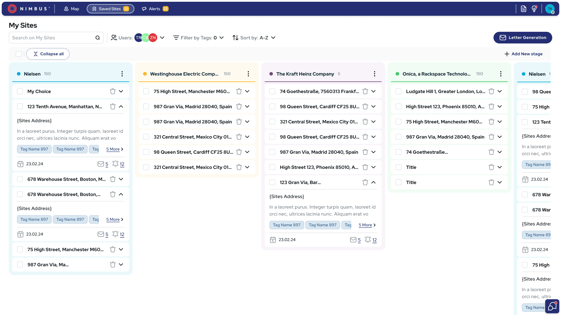
Site (Property) Card: Usability sessions revealed that users were overwhelmed by dense details. I redesigned the card to highlight key insights up front and break content into clearer, more scannable sections.
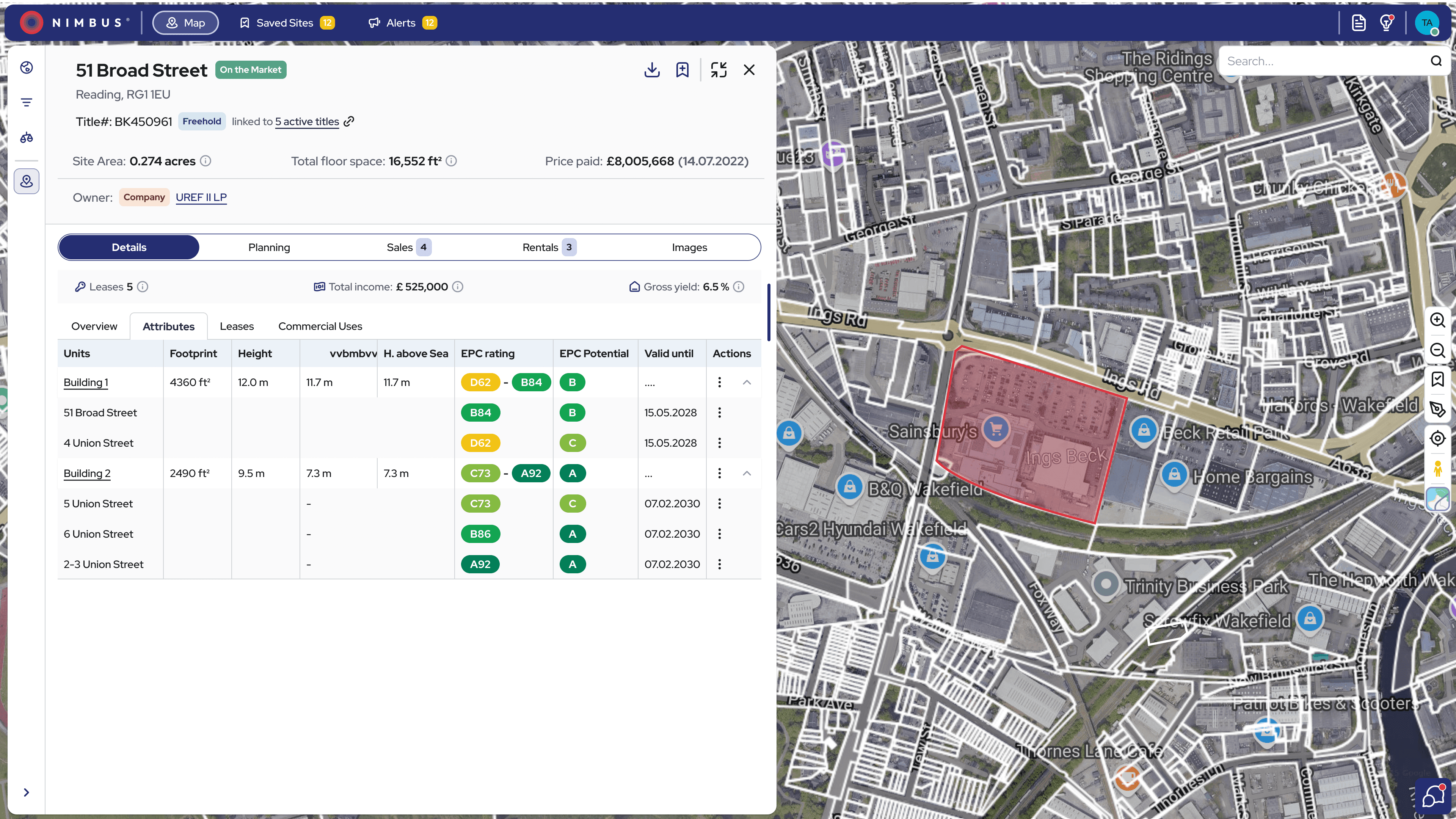

Refined Site card for better scannability.
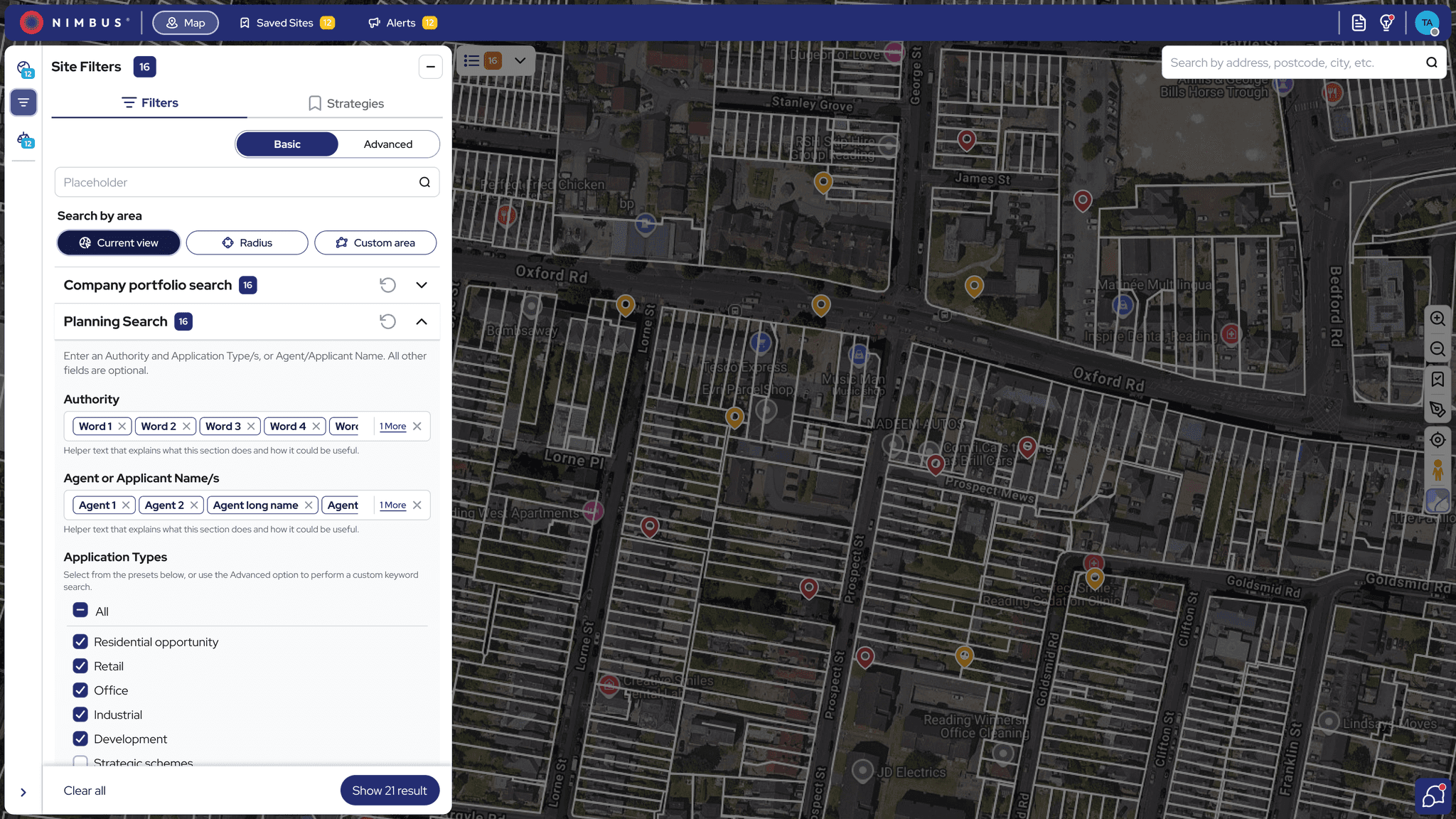
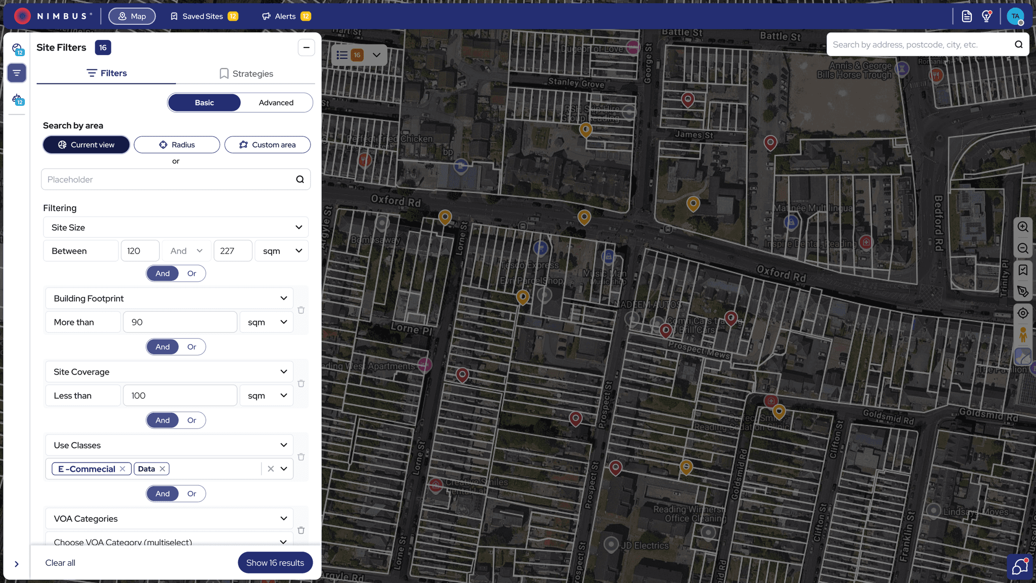
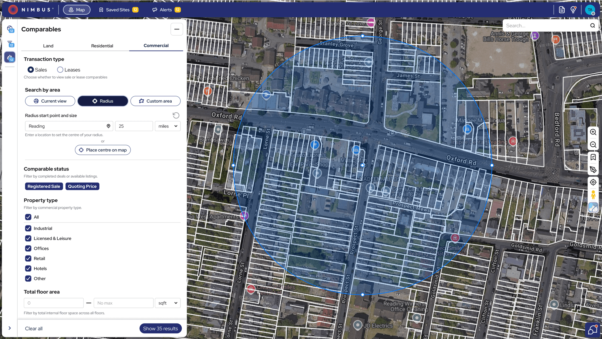
Basic & Advanced Filters: Based on usability testing insights, I restructured the filtering system to make it more intuitive and immediately accessible—reducing search time and helping users find key criteria faster.
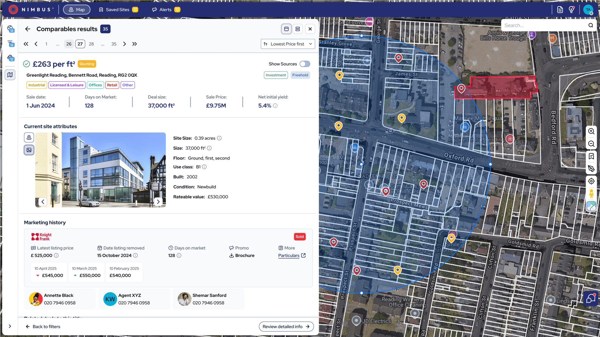
Comparables Tool: Testing showed users had difficulty accessing and using comparables. I transformed it into a dedicated tool with enhanced controls, enabling easier comparison without losing map context.
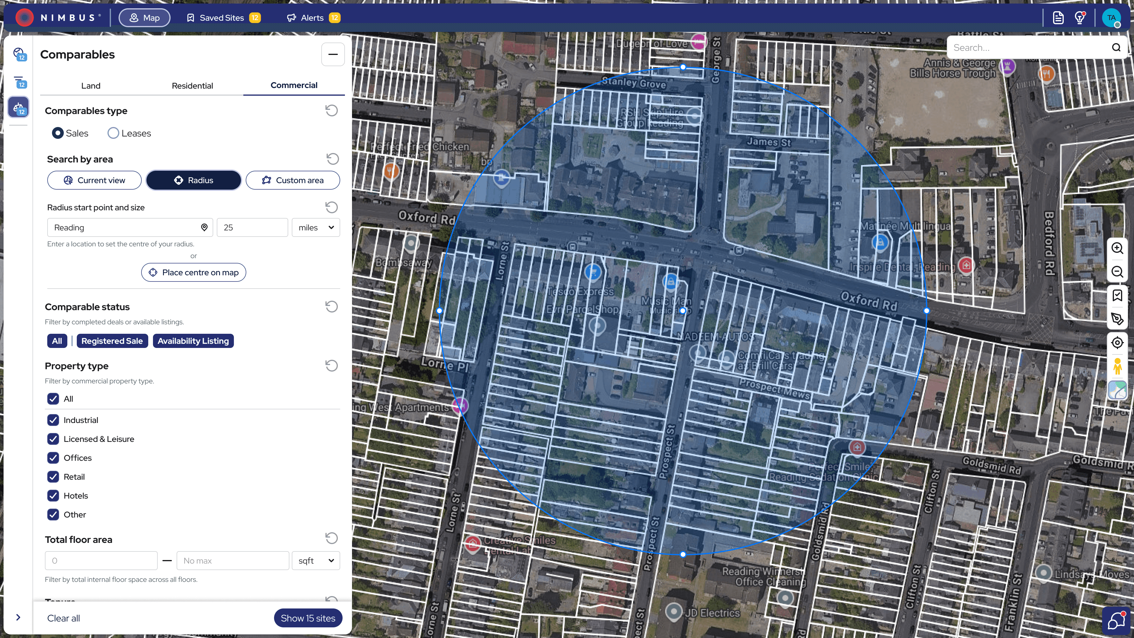
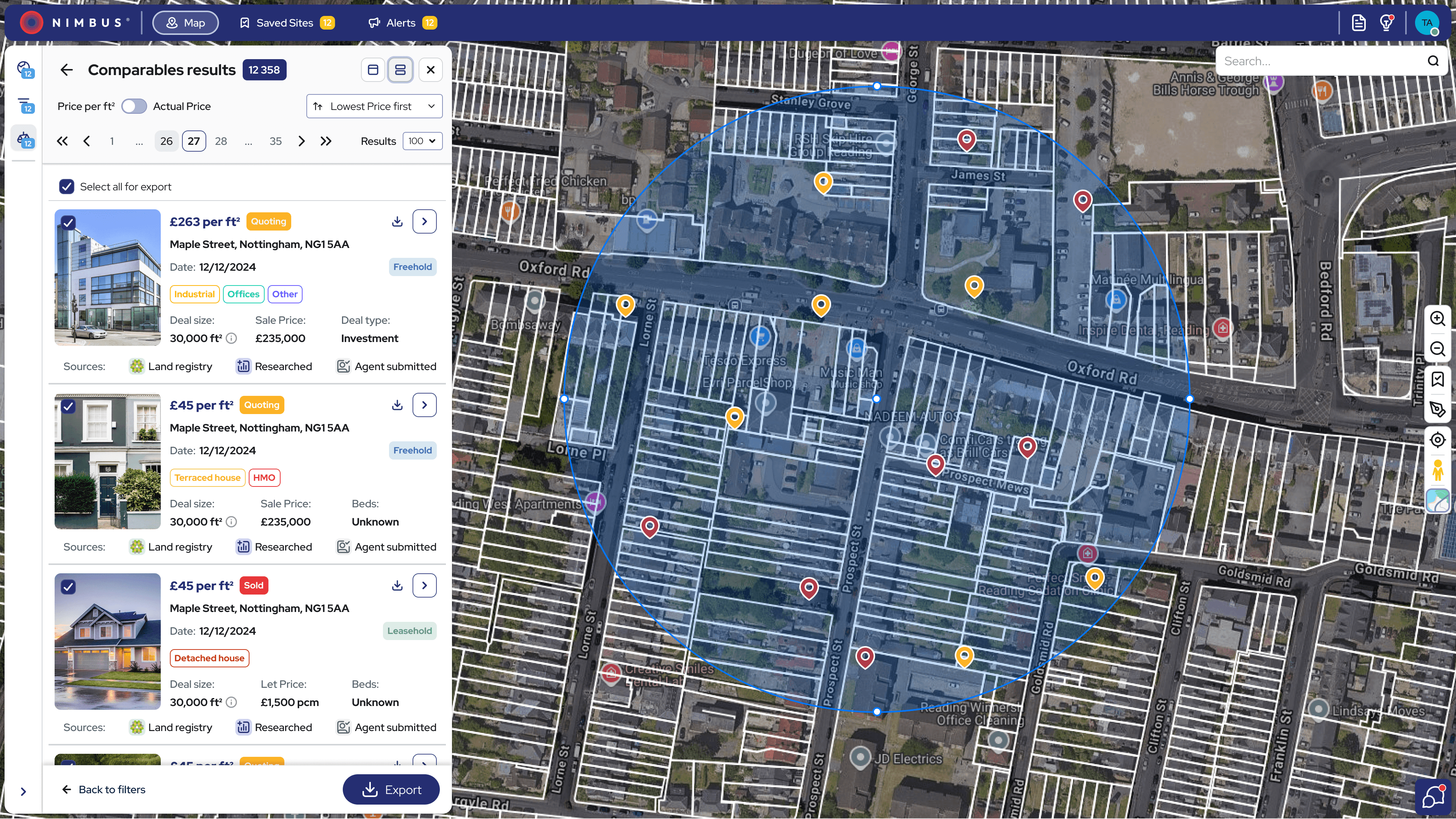
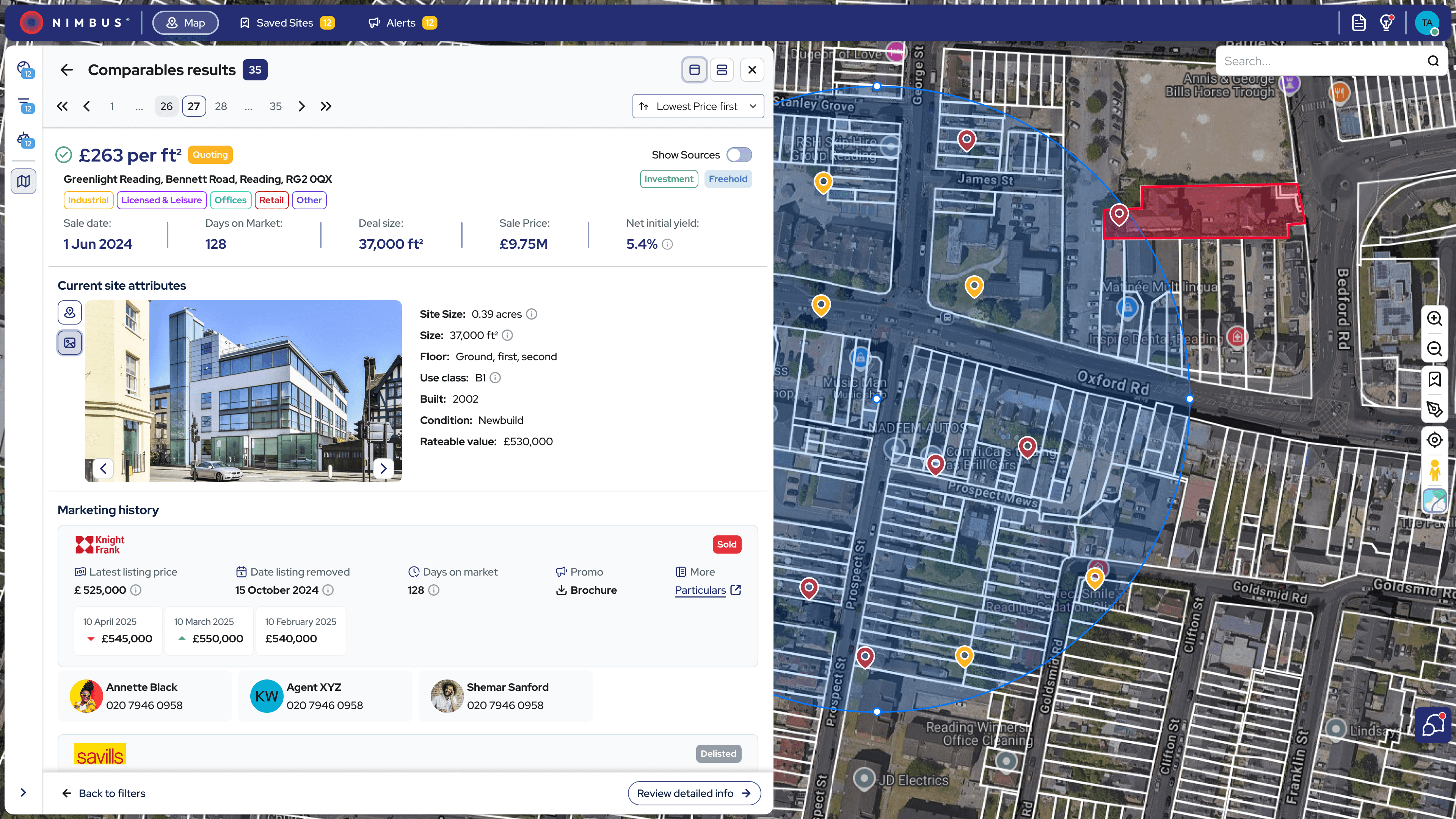


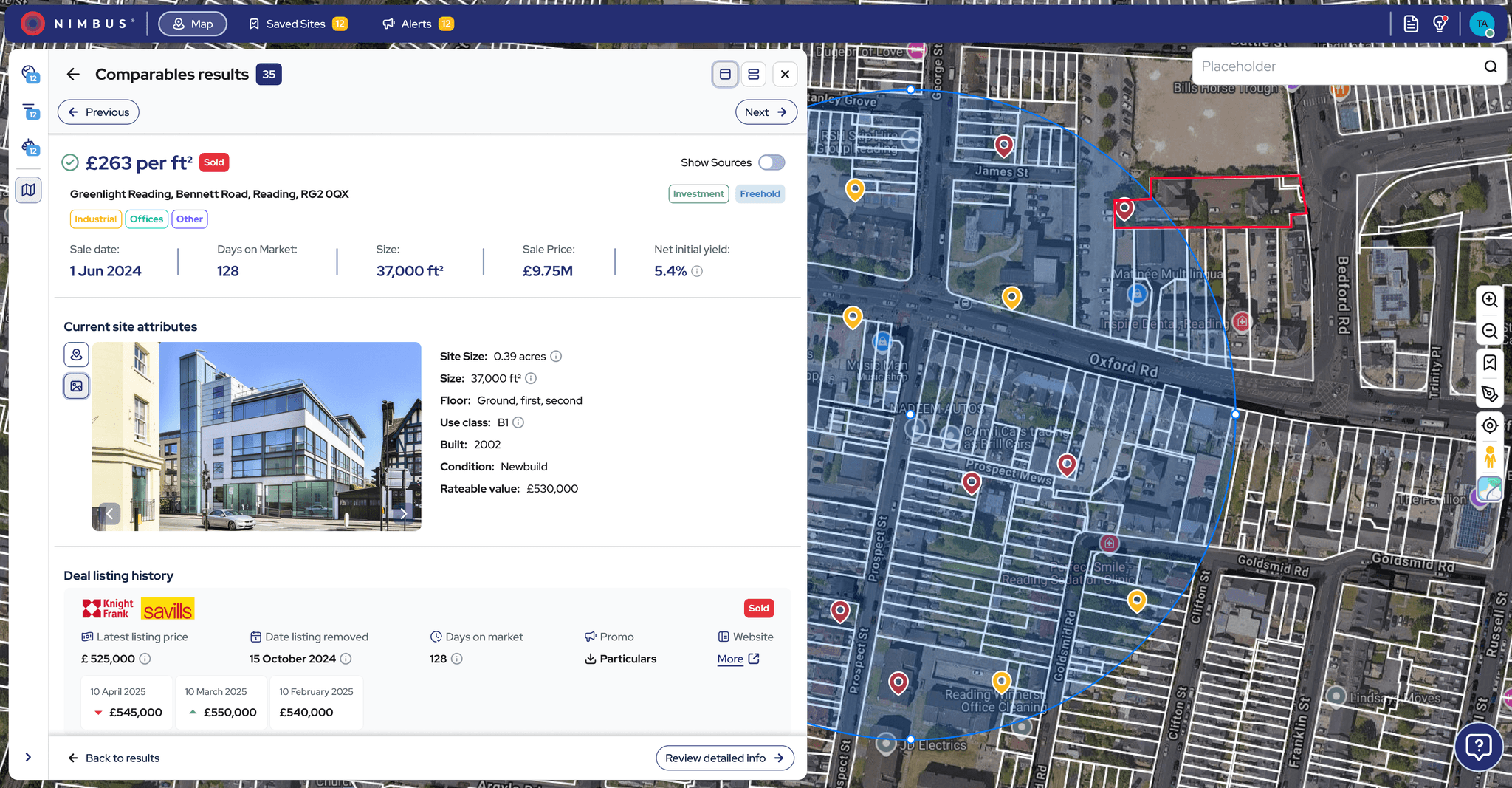
Updated comparables filtering and results with added export functionality.
Letter Generation Tool: Introduced as a brand-new feature, the letter generation workflow was tested iteratively with users. The final step-by-step format helped reduce errors and made bulk outreach simpler and more efficient.
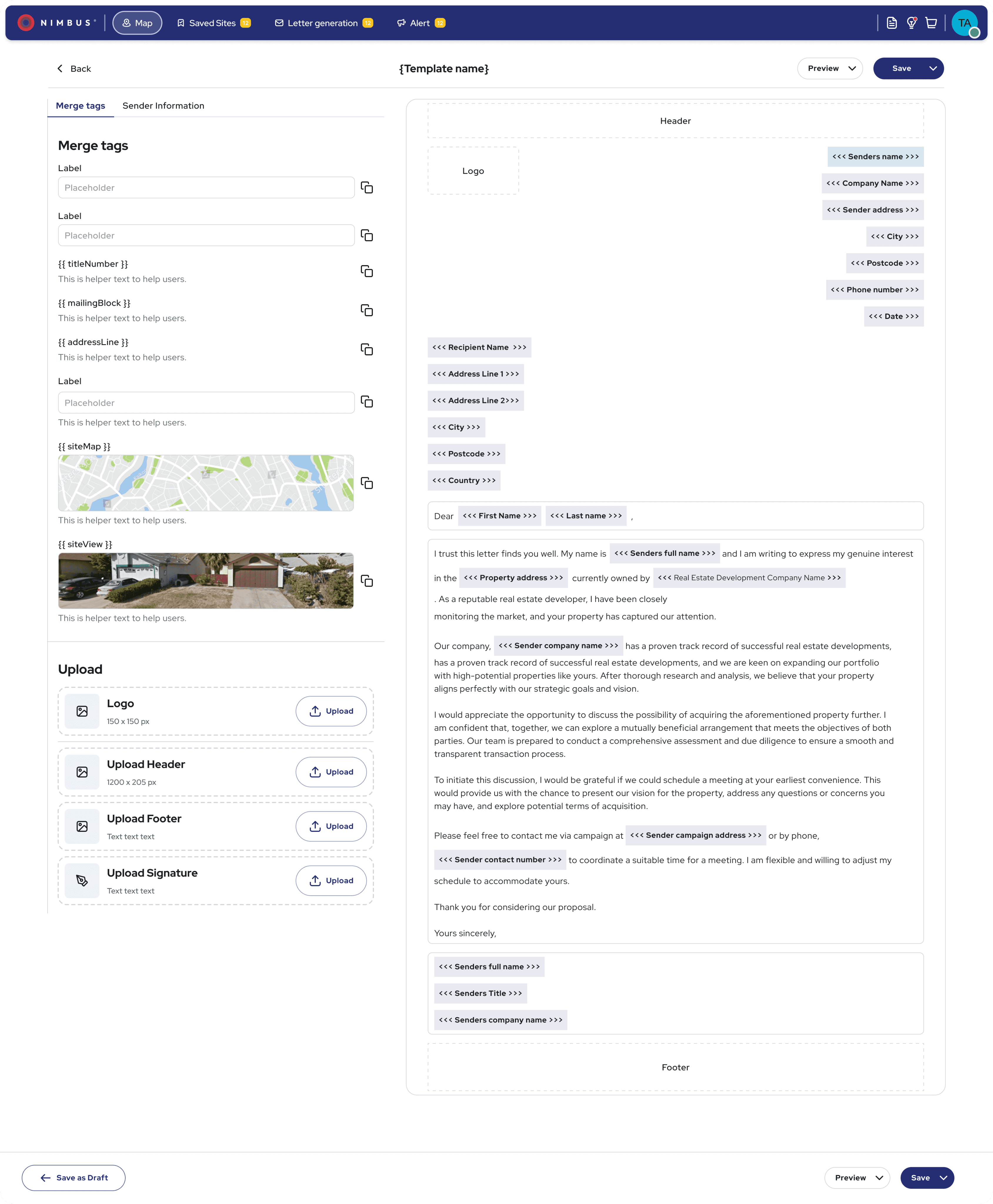
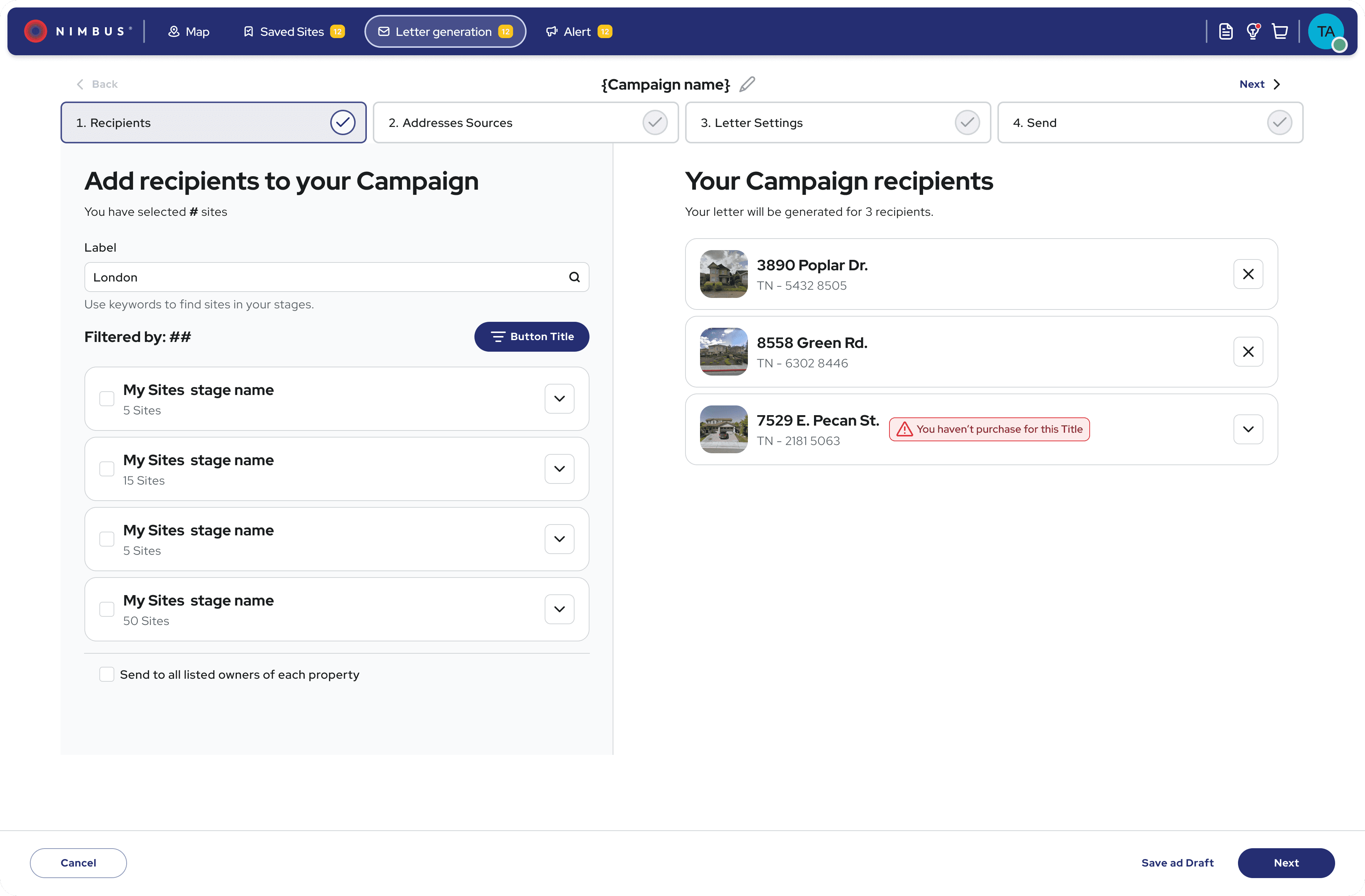
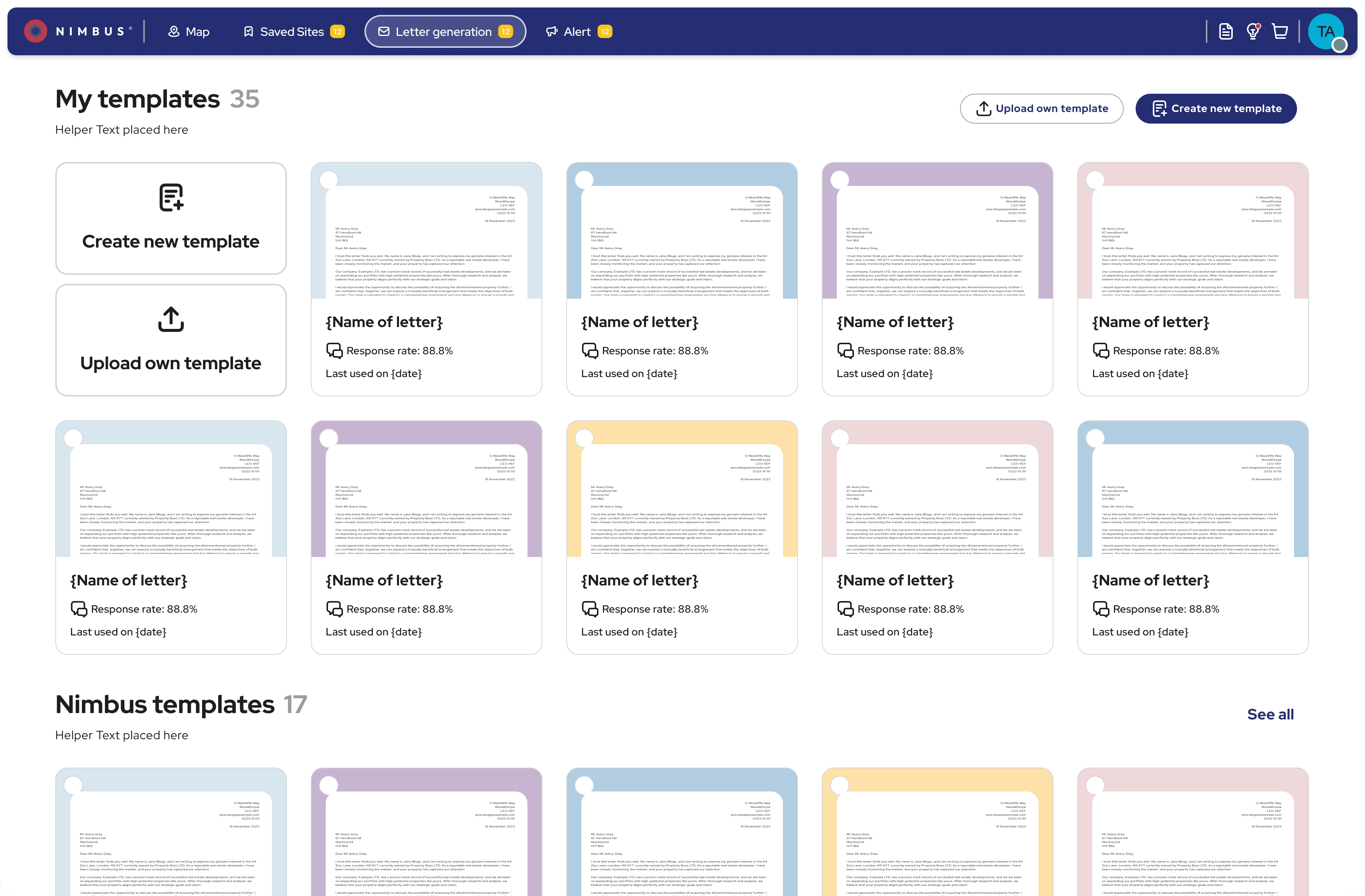
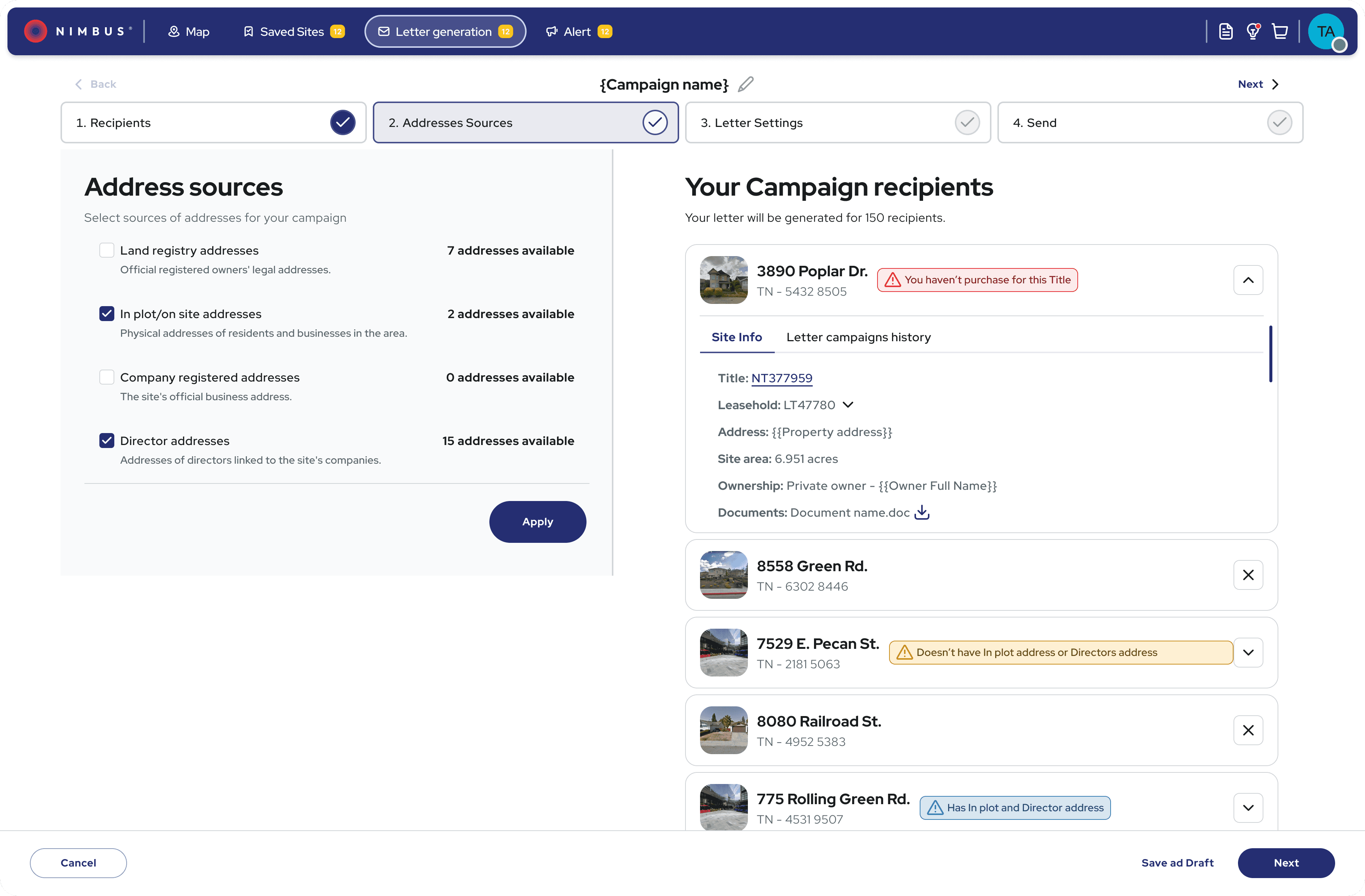
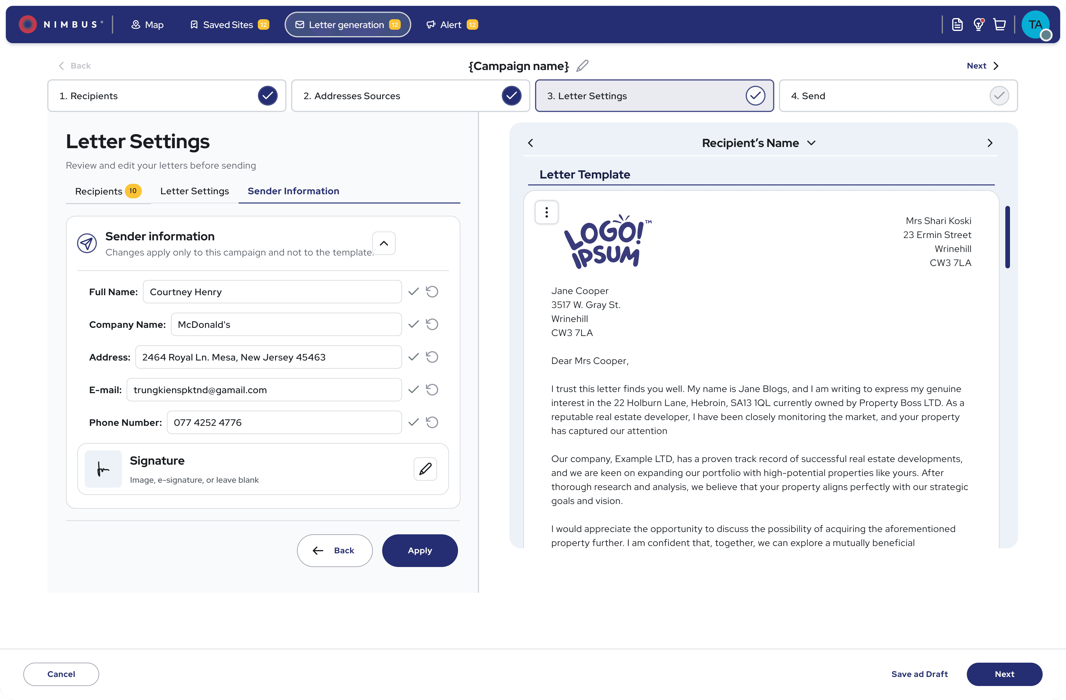
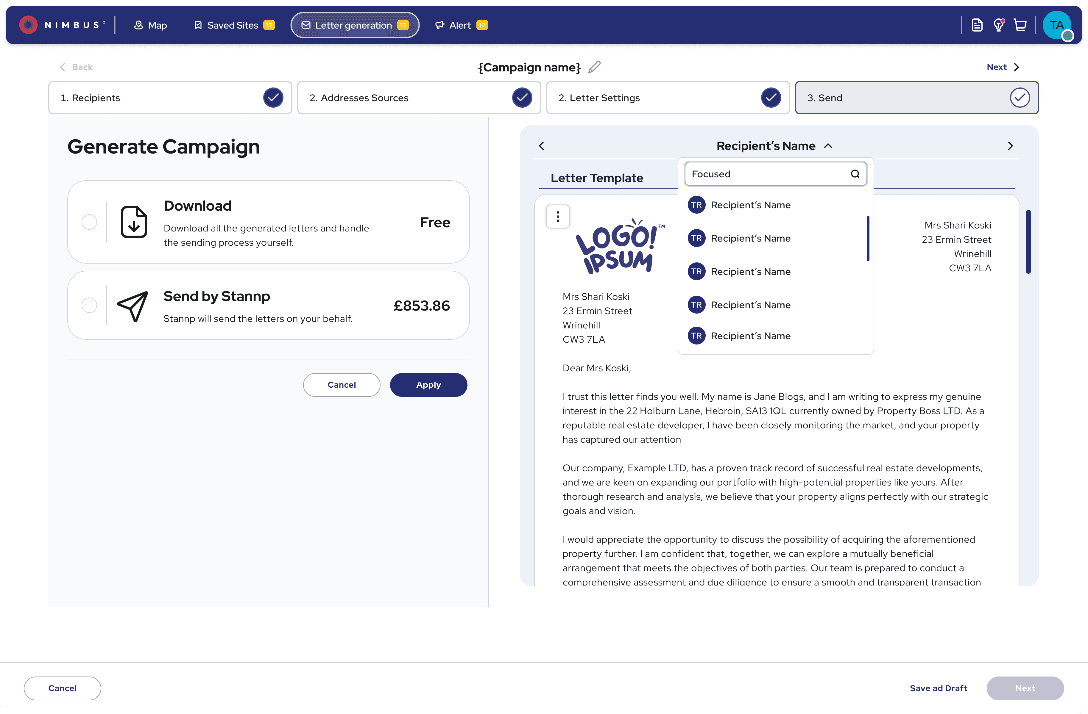
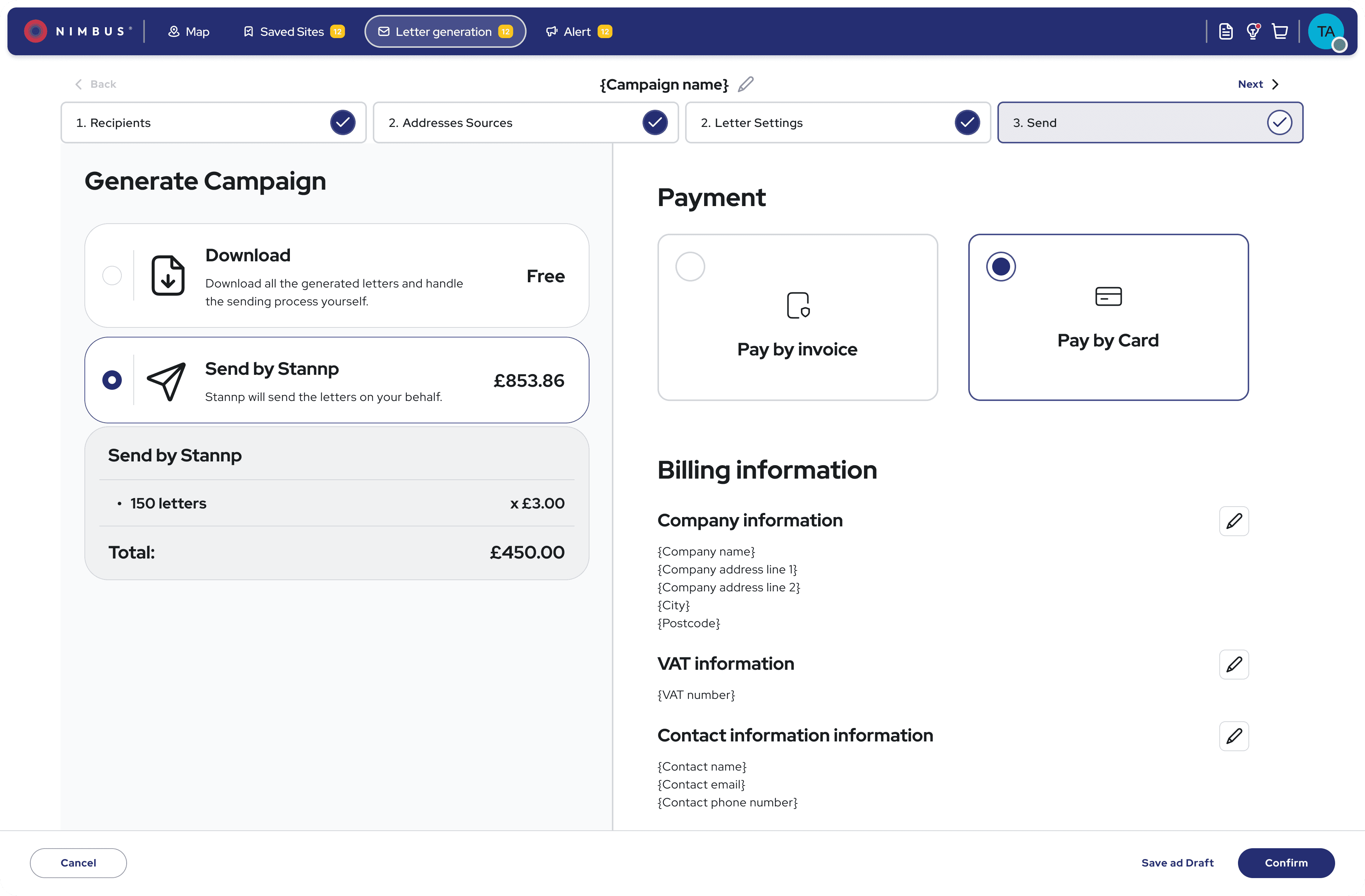
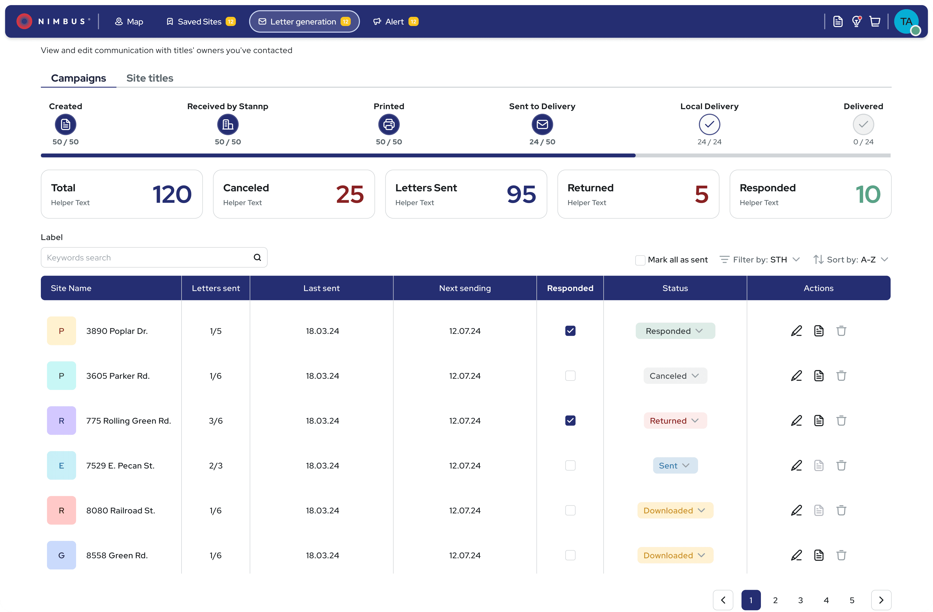
Letter generation screens—enabling users to create, personalise, and send bulk campaigns with ease.
Delivering the Final Product:
Delivered high-fidelity mockups, interactive prototypes, and detailed tickets for a smooth developer handoff
Collaborated in sprint reviews and design QA to ensure visual and functional accuracy
Achieved 98% design implementation accuracy across web and mobile platforms
Presented final designs to stakeholders, receiving highly positive feedback and buy-in
After a LinkedIn post previewing the redesign, we received numerous messages from users requesting access—validating demand and excitement even before launch
The Impact: A More Efficient, Intuitive Platform:
Although the new version is still rolling out, early results and testing feedback show strong improvements:
Introduced onboarding to the current version, which already reduced support requests and improved user confidence
25% increase in user satisfaction (from usability tests)
30% reduction in user friction (based on task flow testing)
Positive response to the new design system—accelerated dev handoff and improved consistency
Stakeholders reported higher confidence in the platform’s usability and market competitiveness
After a teaser of the redesign was shared on LinkedIn, we received messages from curious users asking: “How do I get access to this version?”
“This feels like a completely different product—so much easier to use!”
Usability test participant
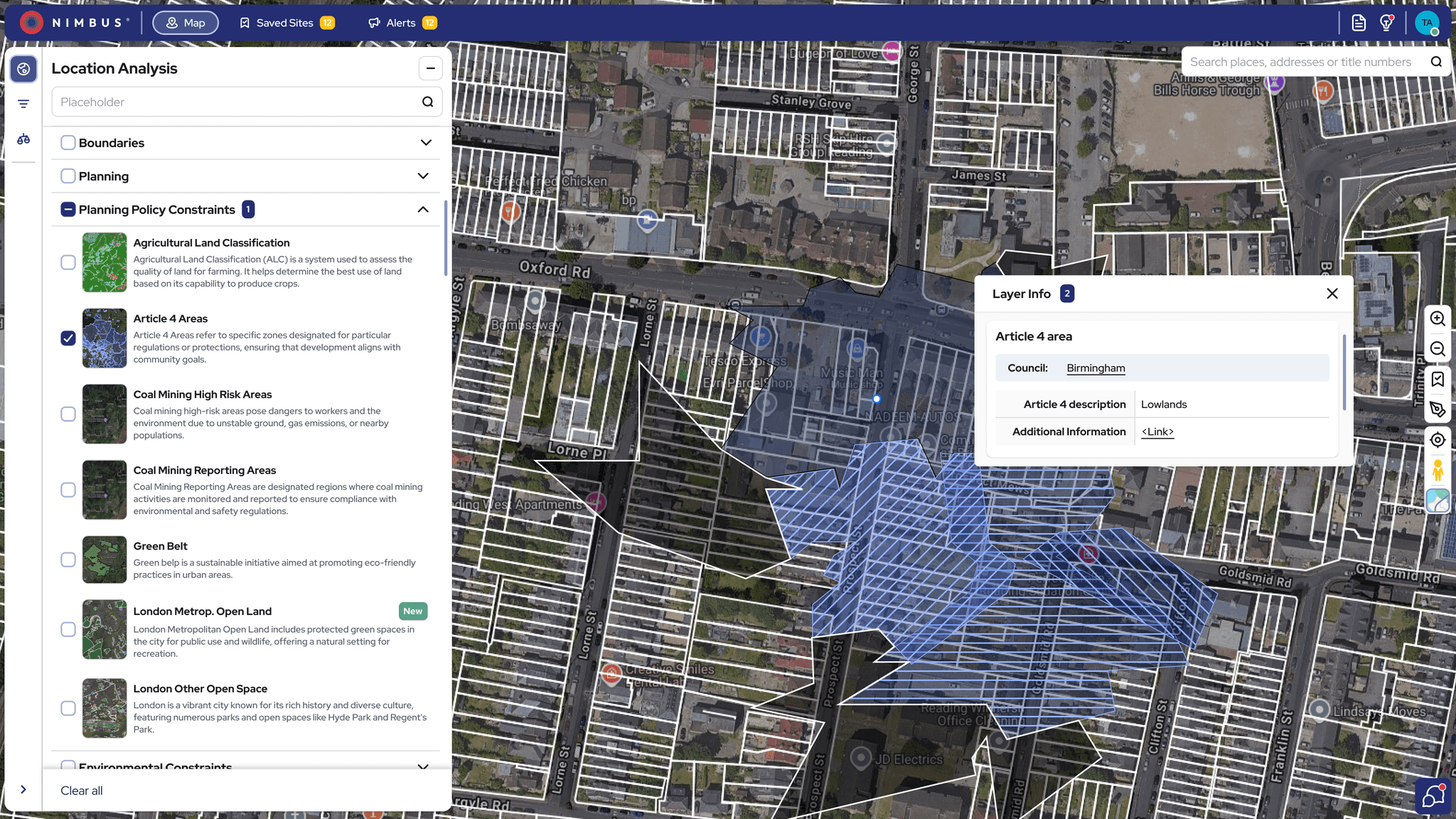
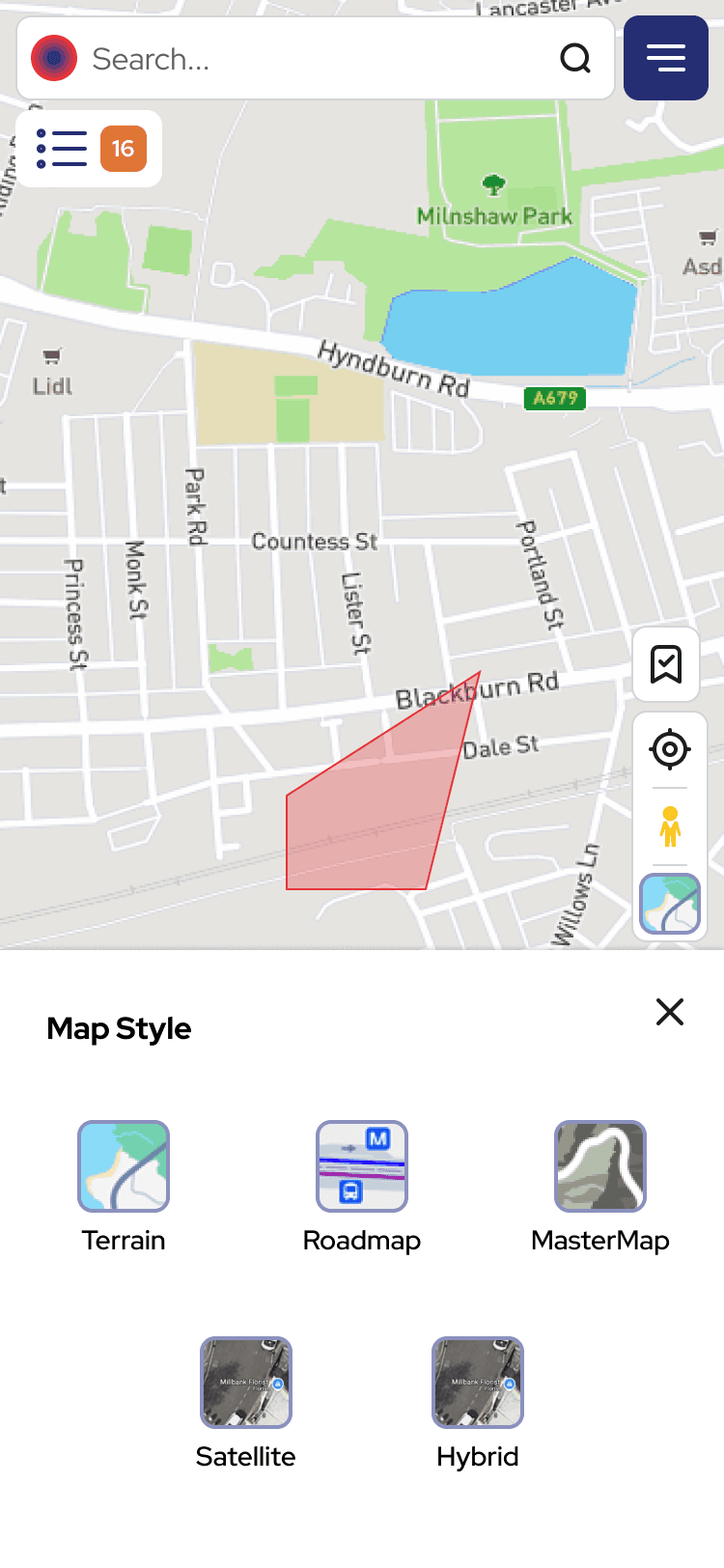
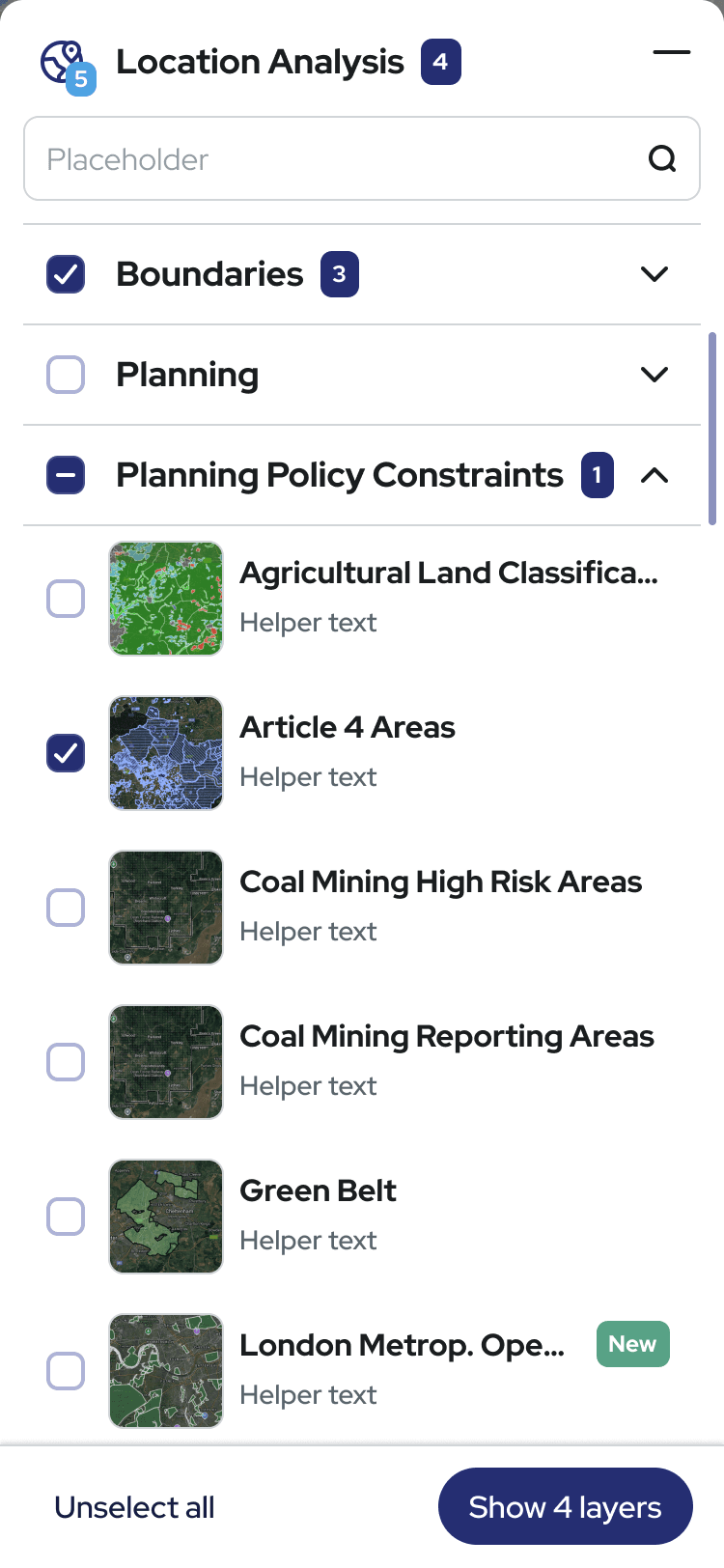

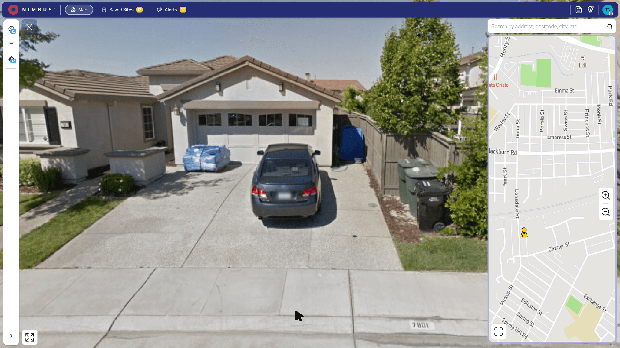
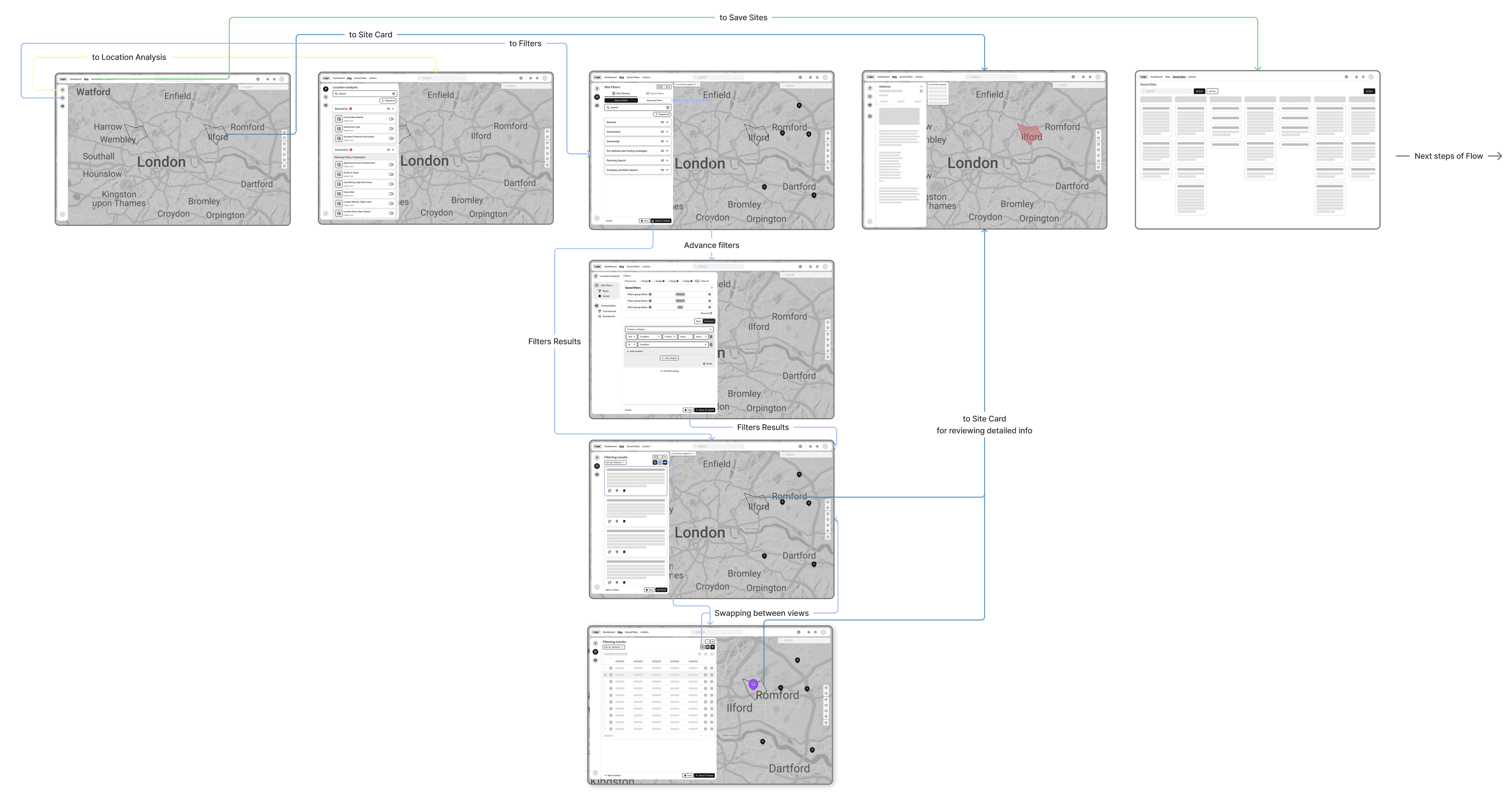
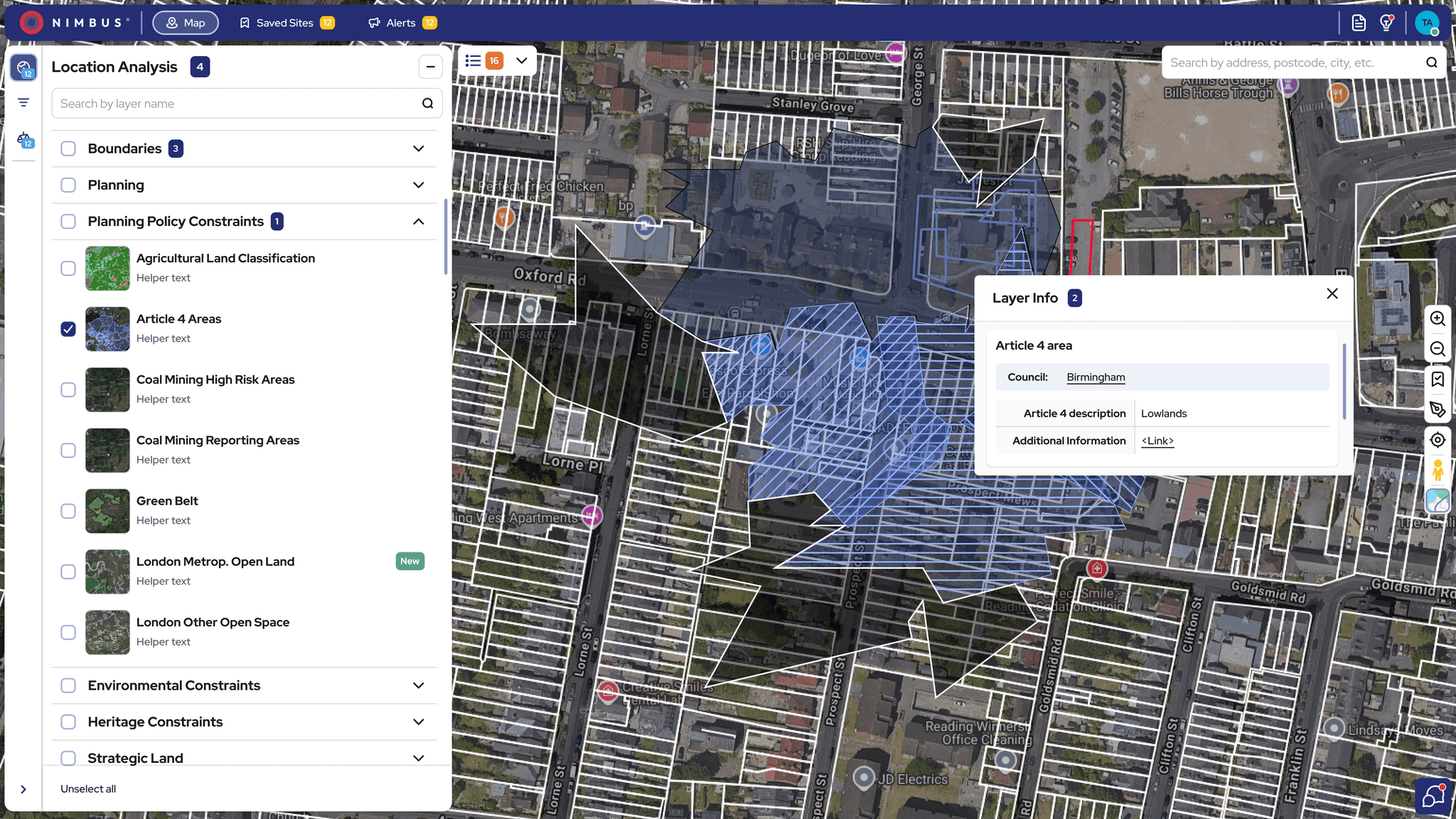
Redesigned interface with key modules—Location Analysis, Filters and Mobile view—for faster navigation and smarter decisions.
Prototype:
Coming soon
Lessons Learned: Designing for Data-Heavy Systems
Designing for complexity taught me to:
Balance clarity with depth – Simplify workflows without dumbing them down, supporting both new and expert users.
Lead with research – Let user insights guide priorities and uncover real opportunities.
Design system-first – Use systems to scale decisions, ensure consistency, and speed up delivery.
Collaborate early and often – Cross-functional alignment was key to building trust and shipping smoothly.